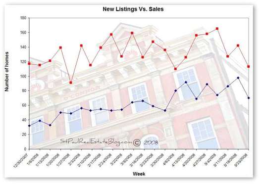
The red line on the chart above shows the number of homes that were listed for sale through the Regional Multiple Listing Service (MLS) each week since the beginning of the year. The blue line shows how many homes had offers made on them during the same week. (Only offers that were accepted by the sellers are counted.)
Activity is always the highest in the spring months and often peaks in April or May. There are more homes on the market and more buyers too. Last year at this time the number of listings were rising while the number of purchases was falling. The over all number of listings and sales is down from last year. As the local market becomes more balance the two lines are getting closer together.
Listings Vs. Sales for May 2007
For more numbers see local market conditions and home prices


Sorry but am I missing something? I don’t see the two lines getting closer. They seem parallel to me.
last year the two lines were going in opposite directions. as in sales were down, listings were up. at the beginning of this year the red line and the blue line were further apart than they are now. Yes they are also parallel, but there is less distance between them so they are closer together than they were.